CSR Design System
A flexible system for a new corporate social responsibility platform poised for rapid growth
Summary
This project had two objectives: to create a foundational design system to pave the way for a comprehensive set of guidelines, standards, and reusable components, ensuring a consistent and cohesive visual language for the Corporate Social Responsibility platform and, as a proof of concept for the much larger Grants platform. This design system would help ensure a consistent and friendly user experience that meets accessibility and brand standards.
My role
As the product designer and team lead, I was responsible for project management, user research, ideation workshops, creating design system files, componentry, documentation, and coordination with engineering.
Challenge
Creating a design system as a company initiative intended as a proof of concept for the larger grants platform posed a crucial challenge. Before creating the design system, the organization struggled with a fragmented approach to design and development. Both design and engineering teams were independently crafting their own component libraries, and the absence of a centralized repository for reusable components made it challenging to maintain a consistent and coherent interface. To ensure this, it was imperative to lay down fundamental foundations, establish design patterns, and create flexible components that could scale with rapid growth.
User research and discovery
To begin the project, I conducted a working session with the initiative stakeholders and working team members from the design and engineering teams. This session aimed to assess the group's existing knowledge about design systems to uncover and set expectations. I collected patterns and practices from other widely recognized public design systems to share with the group to help envision possibilities.
In another workshop with the design and engineering teams, we, as the users, aimed to identify and prioritize our wants, needs, and current pain points. We did this in an activity where each team member wrote down what they wanted, needed, and found challenging on sticky notes in a 20-minute session. Later, I gathered and organized these notes into a table. I followed that by providing an overview of our current state by comparing the designer’s design system files with the engineer’s coded component library. This allowed us to identify and discuss disparities and potential areas of alignment and how we could adapt or reuse the existing code.
Themes
Building strong foundations, components, and patterns to support future growth.
Ensuring continuous alignment between engineering and design at every stage.
Emphasizing the critical role of documentation in the system's success and user satisfaction.
Users
Product designers
Developers
| Wants | Needs | Painpoints |
|---|---|---|
| I want the component library to be easy to maintain | I need better documentation to do my job | I feel like efforts so far have been siloed and haphazard |
| I want onboarding to be easy and straightforward. | We need to be as efficient as possible, I want us to cut out all the bloat | There isn't a process in place to review components |
| I want the system to ultimately create a wonderful user experience. | We need a very flexible system | I have a hard time knowing how to use the code in the component library. |
| I want the design system to save us all a lot of time | We need to make this initiative a success | I think we are overly complicating the component library with too many cooks in the kitchen. |
| I want a design system that ensures a uniform and visually cohesive user interface. | We need a design system that readily adapts to changing design trends and emerging technologies. | It feels like there's a bottleneck between design and engineering when we need to define patterns. |
| I want a design system that easily adapts to evolving design requirements and product changes. | We need to reduce design and engineering debt. | The design file is a mess |
| I want to minimize the time spent on recreating components | We need detailed and up-to-date documentation to effectively implement design guidelines and components. | I don't know who is responsible for what |
| I want it to reenforce branding and identity | I need engineering to be very clear on their needs from design | We don't have good communication with development |
| I want the company to see the value | I need to know who to talk to when I have questions | The design system file is full of unused components and it make s it hard to know what i should use. |
| I want the engineering team to see and feel the value of a design system | We need better communication between teams. | Not all of the developers are using the library |
| I want to prioritize accessibility and inclusion | I need to understand my role and the expectations associated. | We don't have a place to find site wide patterns |
| I want better communication, meetings, handoff, etc... | We need better processes, meetings, and goals. | There isn't any documentation for developers |
| I want this to reenforce branding and identity | we need more information from design on things like truncation, currency/date formats, etc. | The current component library does match the design files |
Solution
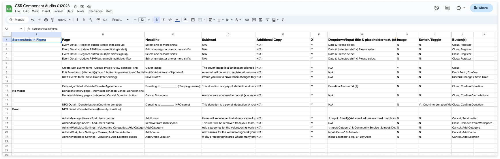
We performed a thorough audit of the existing design system files and the engineering component library to identify missing elements and necessary modifications for our initial phase. Given the active use of the component library in the code, we prioritized it as our primary reference.
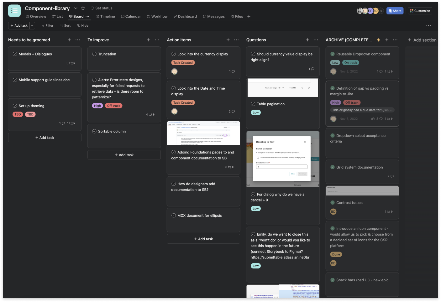
Project management relied on Asana for designers and Jira for engineering. I conducted weekly team meetings to monitor progress, share work, and encourage brainstorming. To streamline our workflow, I structured Figma files to distinguish between working design system files and development-ready files.
Regarding documentation, we adopted a light approach at the outset, adjusting the format as needed. Both design and engineering teams contributed to the ongoing documentation process.
Hypothesis
Implementing a design system will unify design and development, enhancing visual and functional consistency across all user interfaces. This unity streamlines the design and development process, reducing effort and increasing productivity. Additionally, the design system promotes product scalability, faster prototyping, and improved team collaboration. By incorporating accessibility guidelines and maintaining brand consistency, the design system further reduces long-term maintenance efforts and costs.
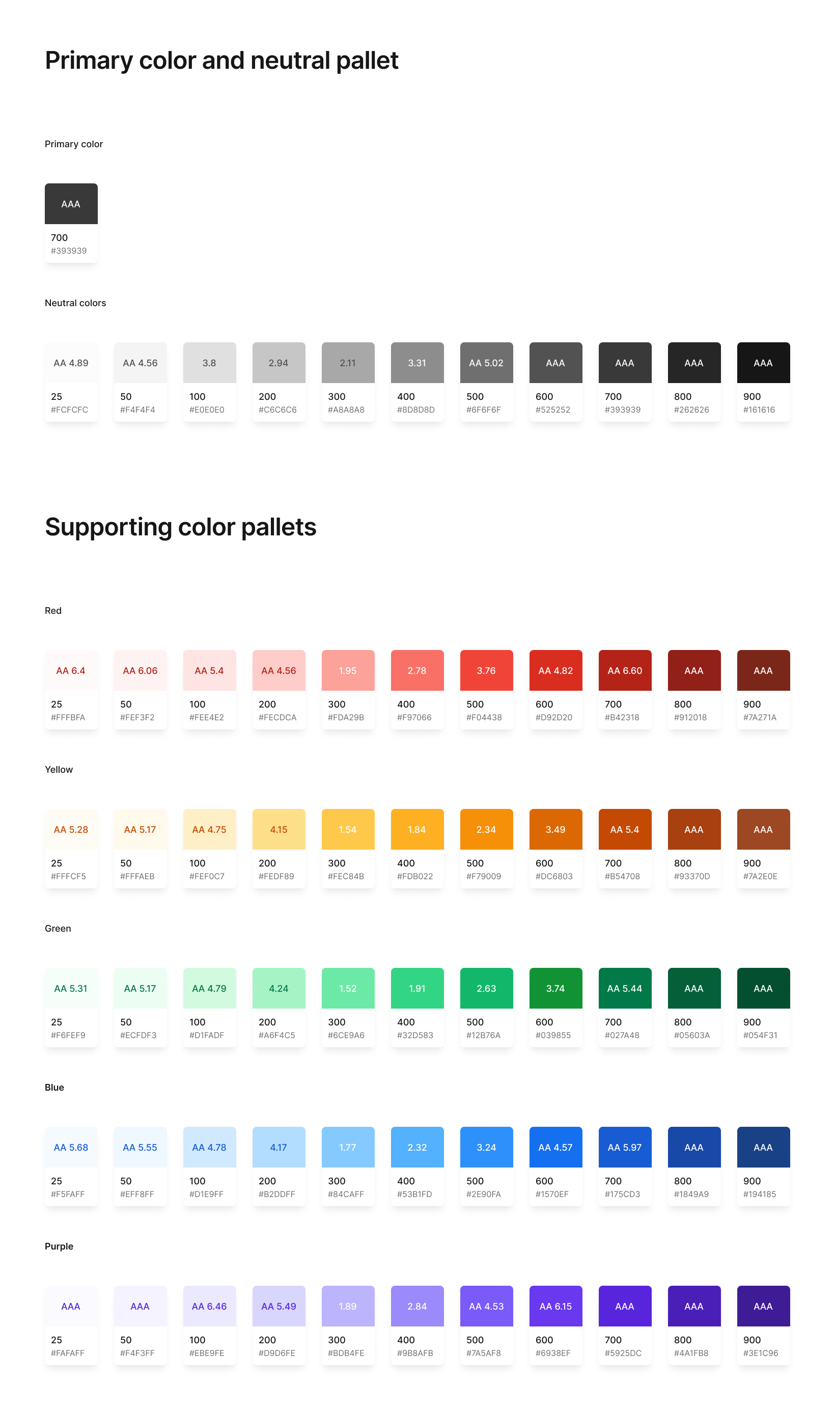
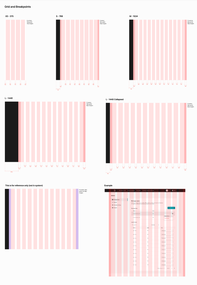
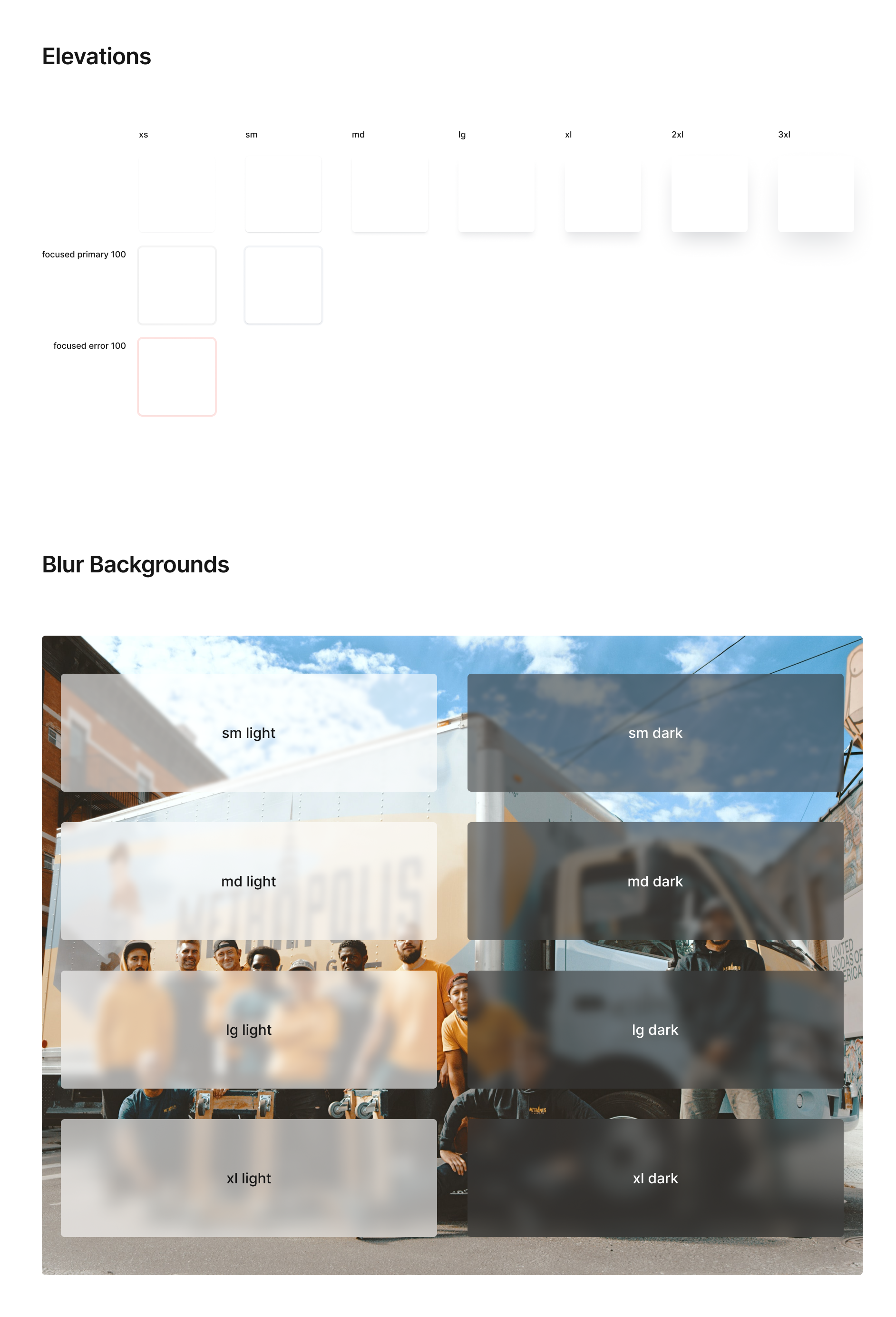
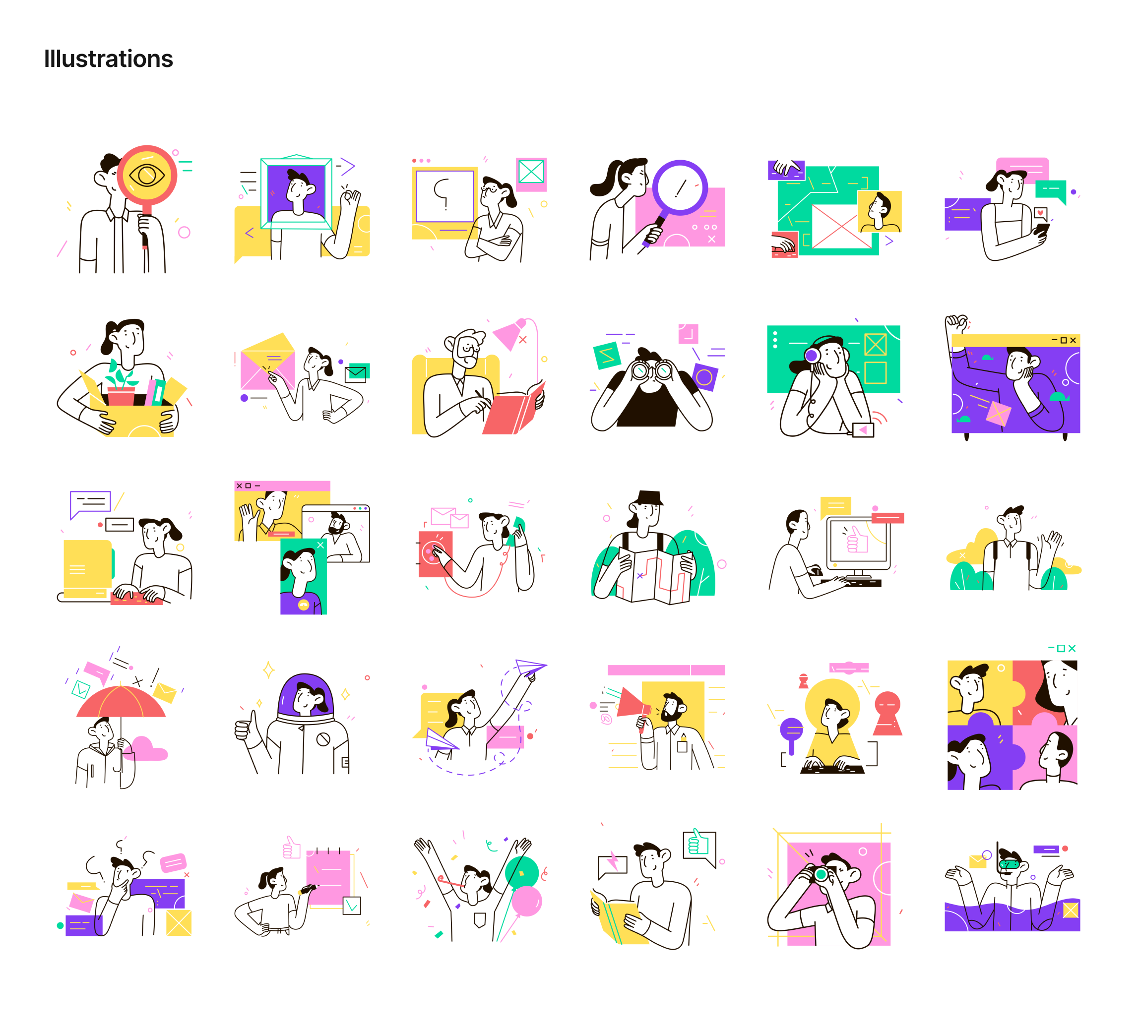
Foundations
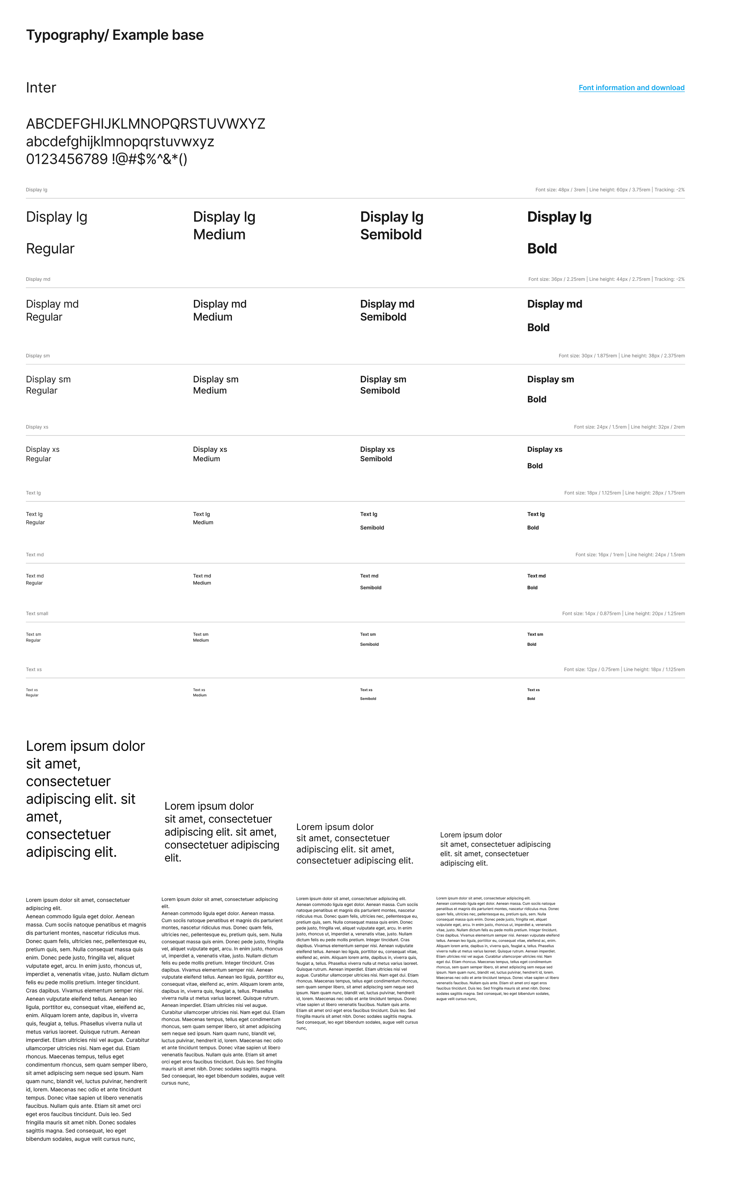
After finalizing our project management and approach, each team began their tasks. I focused on redefining foundational elements: typography, colors, grids, page layouts, illustrations, and icons. I led the design work and regularly checked with the broader design team. The engineering team revamped coded components for the new design changes.
Design system files
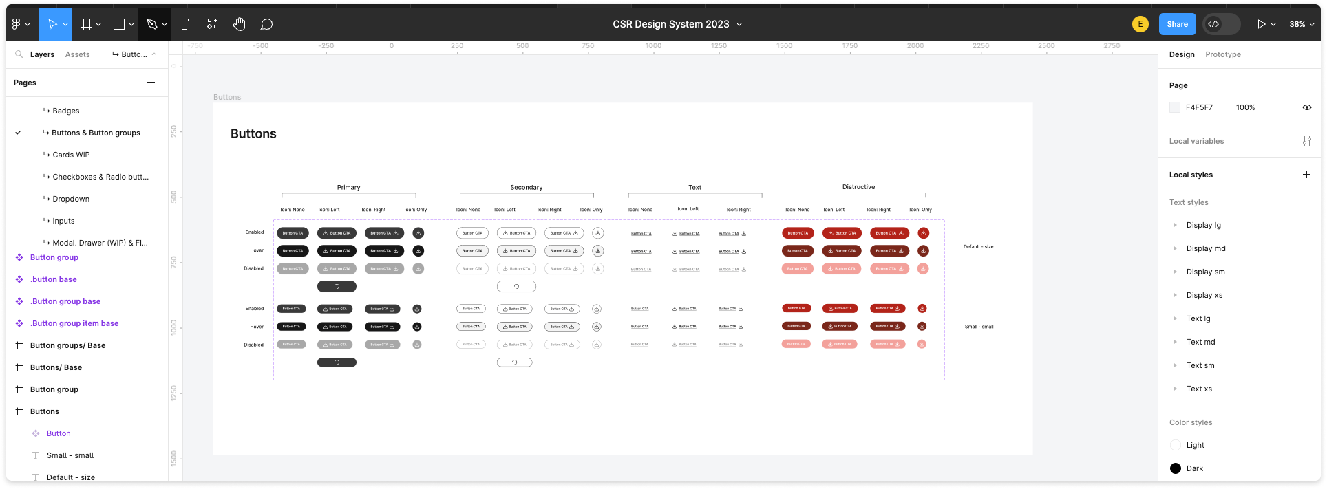
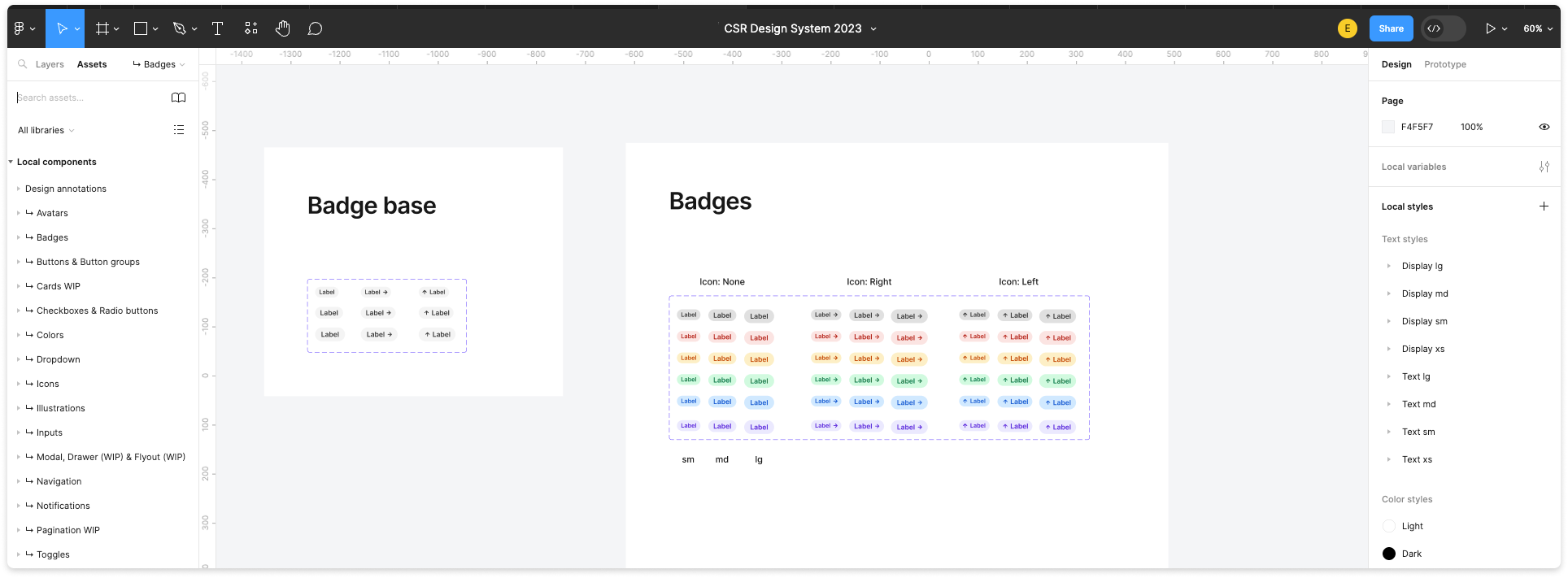
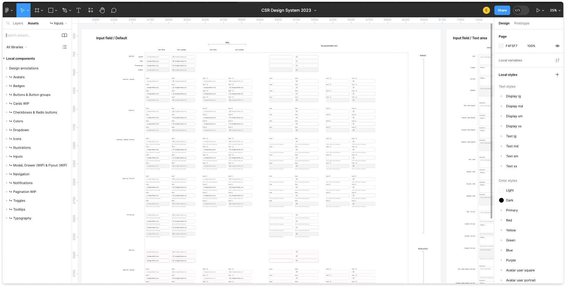
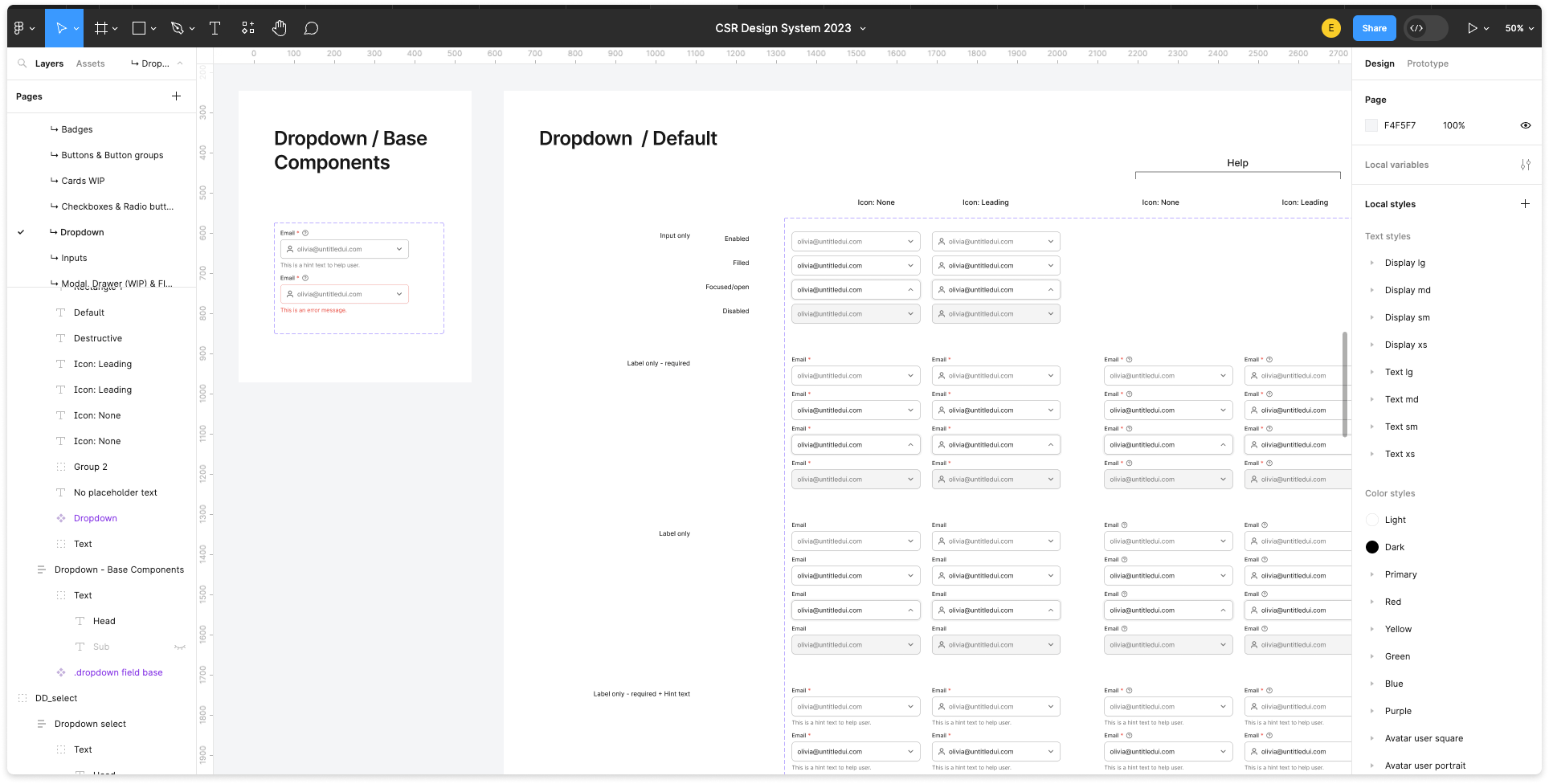
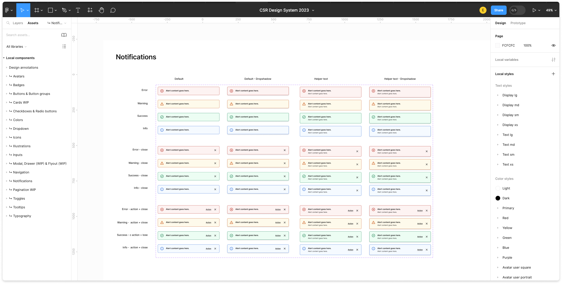
At the same time, we tackled our prioritized components, handling multiple tasks concurrently. I collaborated closely with developers to streamline existing code components for comprehensive changes. We aimed for simplicity and flexibility in all components, both for our use and for future adoption by the larger organization. We prioritized one to two components per sprint, potentially more when time allowed.
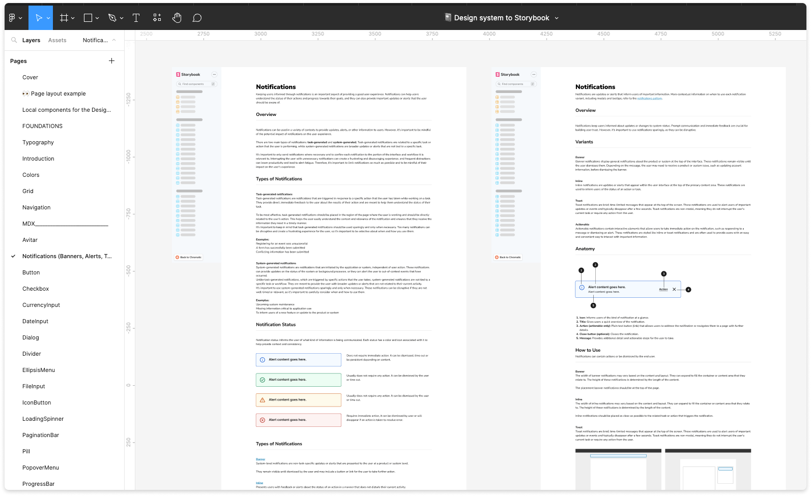
Files for engineering
I created a componentized template of a Storybook page so I would be able to pass on exactly what was to be included in a page. This was very helpful for both design and engineering when it came to documentation requirements.
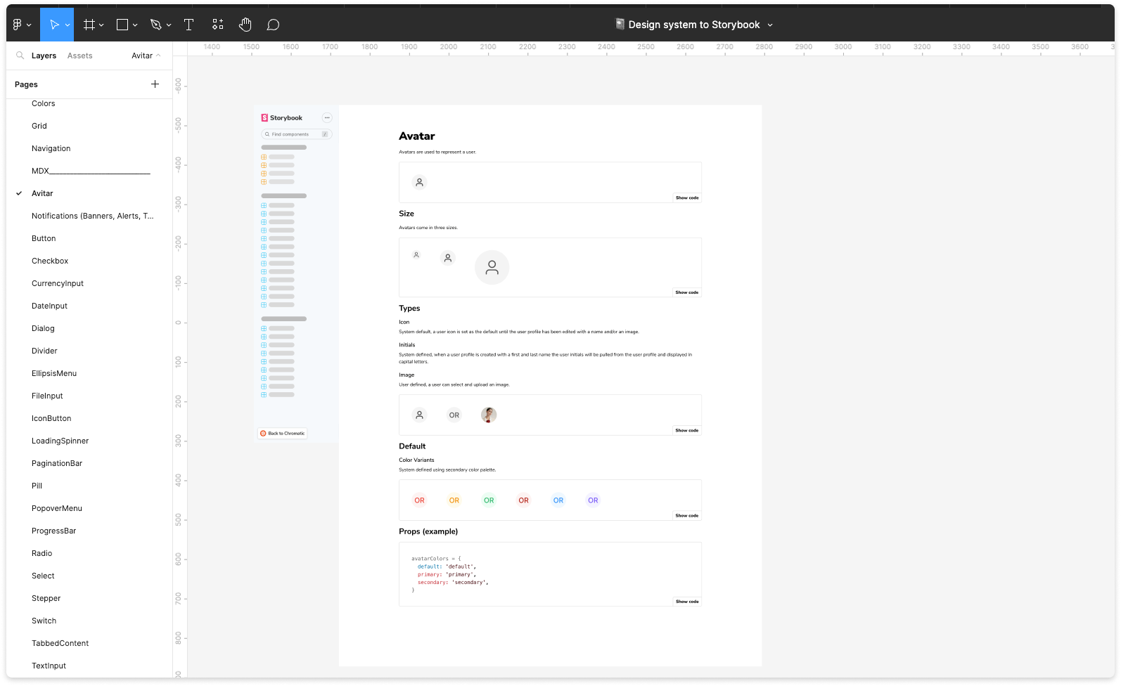
Results
The design system's implementation has delivered notable outcomes. It has encouraged closer collaboration between design and engineering teams, with a high adoption rate of the component library among engineers, expediting design-to-implementation processes. This streamlining effect reduces overall effort and significantly boosts team productivity. The design system has also improved product scalability, enabling faster prototyping and more efficient feature development. It enhances visual and functional consistency across user interfaces, ensuring a unified and standardized user experience. Incorporating accessibility guidelines and maintaining brand consistency contributes to cost-effective, long-term maintenance. These outcomes affirm the hypothesis that the design system unifies teams, enhances consistency, streamlines processes, and promotes collaboration, and these metrics will be quantified in upcoming quarters. Moreover, the larger grants platform is currently in the process of adopting this design system, extending its positive impact across the organization.